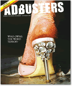
This month's cover of Adbusters features the work of photographer and photorealist painter Marilyn Minter. Though she is renowned for her photography, unbelievably, this is enamel on metal. I know photorealism sometimes simply needs a projector and a photograph to create, and as such, is often looked down upon; however, her work takes photorealism to a new level, and is magnificent. To me, it is gorgeous and very evocative of fashion advertising -- but injected with the political and mysogynistic cruelty that is so often ignored by most.
However, I am confused by Ms. Minter.
First off, this piece of Minter’s was an excellent choice for this issue, and she did well to allow it's use. I was impressed with Adbusters' utilization of her depiction of a foot clad in a bejeweled Dior heel that is caked with filth, juxtaposed with the words “Who Owns the Word Terror?” So much said in a simple painting. The great pains we will take in the “first world” to protect our vile ideas behind beauty, and beauty commerce, and what we swallow as glamorous and beautiful because we are shielded from the suffering that creates it. And of course, hand in hand, how we as the first world are privileged to pick and choose what “terror” means according to our appetites. The death and suffering in an oil rich country whose occupation can provide us a foothold in the Middle East and ownership over possible future oil reserves, yes, terror. The death and suffering in the African blood diamond trade that provides us with cheaper diamonds, no, not terror.
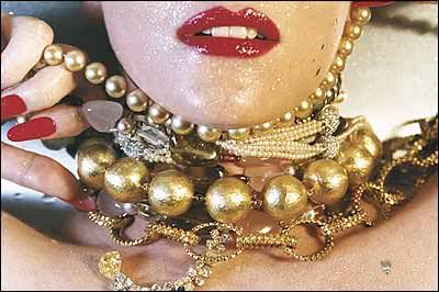
But, even though many critics have swept that possible political untidiness under the rug in favor of focusing on the more vague and pedestrian “pleasures and dangers of glamour” and “cultural anxieties about sexuality and desire” (SF MOMA) in her work, or the sensuality and “tainted desire” of the paintings -- in the sense of fashion as seductive and lustfully “dirty” -- I was still shocked that Minter’s work was used for an ad campaign for high-end (read: $75,000 and above) jewelry.
I suppose contradictions is what is to be expected of an artist who gives vague statements about her work like this:
I'm trying to make an image of what it feels like to look. I want to make a fresh vision of something that's compelling; something that commands our attention; something that is so visually lush that you'll give it multiple readings adding your own history and traditions to the layered content. Some things make you feel transcended; others make you feel slimed. I'm constantly looking for that transcendent moment.
I understand “layered content” but I am at a loss when it seems that an artist wants to be everything for everybody. Is her work simply depicting the sadomasochistic “Versace” type of fashion iconography? Making a statement about (insert issue here -- globalization, feminism, capitalism…), or the tragedy behind consumerism and our ideals of beauty? Or a way to make easy money by avoiding these traps and branding these images to the consumer elite and, as is said in Fight Club, “selling their fat asses back to them?” Can it be all of these things, can it be fluid? Or does it need to be concrete if an artist is going to ride the groundswells that obviously contradict each other?
Labels: art, checking yourself before you wreck yourself, class issues
posted by Ammie at 6:29 PM
![]()


0 Comments:
Post a Comment
<< Home